
A Generic Approach to System/Data Monitoring
Disclaimer
The original data I played with are private. The sample data used in this post is fake with similar relative changes as the real data so that the model is firing at the same event
1 Intro
A couple of months ago, I tried to find a generic approach to monitor the data quality of ten of thousands of files containing trading data running through our systems everyday. To try to get alerted ahead of our clients, especially systematic incidents that widely impact all customers on the market such as data lost due to system/network outage.
I decided to use Multivariate Distribution, a.k.a. Anomaly Detection in Machine Learning. It may be one of simplest Machine Learning model out there. It is just a simple statistical model. The beauty of this model is that it can ‘dynamically’ adapt to the characteristic of the data and it works with arbitary number of features.
Code of this post is on Github
2 The Model
The core model is very simple:
- Build a multivariate distribution from historical data which captures the characteristic of every features as well as relationship between features
- Generated the probability for an event based on the distribution.
Anomaly is identified by the model returning a probability below a predefined threshold.
Considered a scenario involves only two features cpu usage and network bandwidth usage of a web server. Figure 1 shows the bivariate distribution of the historical data. It shows positive correlation between two features. It make sense to me the CPU is busy when the network has more traffic.
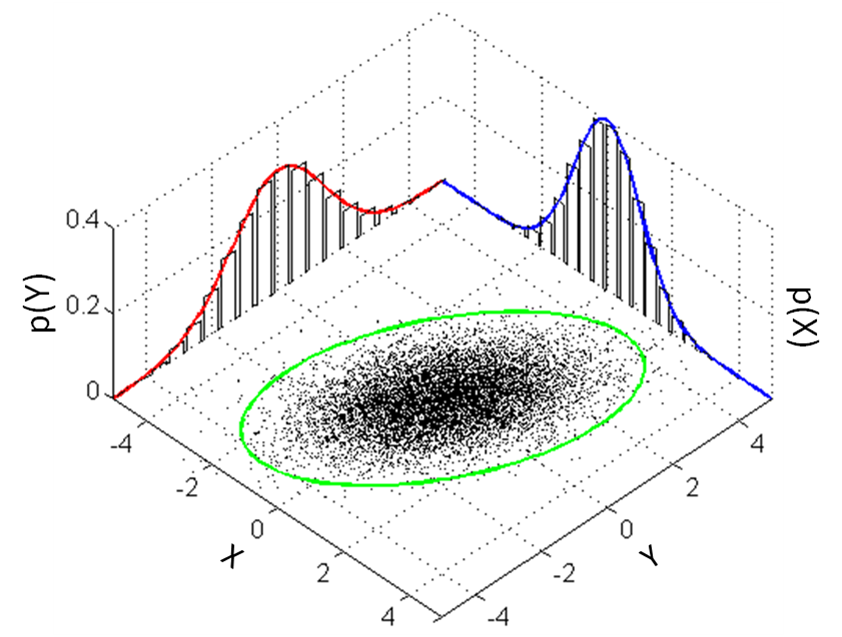 Figure 1: Bivariate Distribution
The ellipse in green is the threshold. Dots fall outside of the ellipse is considered anomaly. For example, the CPU is very busy when the network has few traffic.
The strength of this model is that it does not only capture the probability distribution of individual features but also captures the relationship between features. However, it is also the limitation of the model. It cannot be used on data that fluctuates severely. The model will stay silent on any incident.
3 The Data
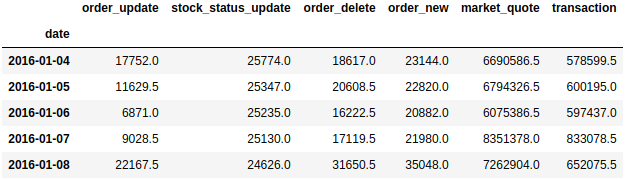
The raw data contains number of activities happened on the day. Such as the number of transactions, etc.
msg_count.head()
3.1 Data Preprocessing and Exploration
As can be seen above, the difference between features are huge. e.g. market_quotes are a few hundred times bigger than the order_new. In order to avoid some features dominating the learning process (which makes other features useless) and also making features closer to a normal distribution, standard scaler needs to applied.
### Manual Standardization
# Shifting mean and std because when accessing mean and std indexed by a given 'date', we want to use mean and std calculated from 'date - rolling_window - 1' to 'date - 1'
rolling_mean = msg_count.rolling(window=rolling_window).mean().shift(1)
rolling_std = msg_count.rolling(window=rolling_window).std().shift(1)

# Standardization
msg_count_scaled = (msg_count - rolling_mean) / rolling_std

### Use the first rolling mean & std to standardize the first 'rolling_window' number of records
msg_count_scaled.iloc[0:rolling_window] = (msg_count.iloc[0:rolling_window] - rolling_mean.iloc[rolling_window]) / rolling_std.iloc[rolling_window]
msg_count_scaled.head()
Note: This could be replaced by sklearn.metrics.StandardScaler
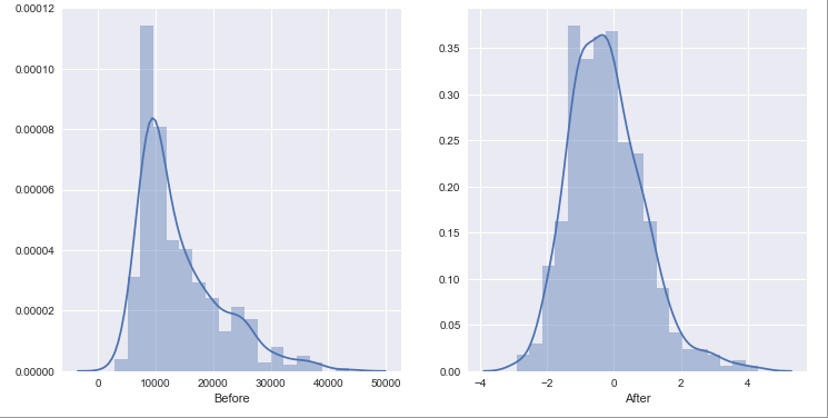
Distribution is closer to a normal distribution after the standard scaling.
fig, axs = plt.subplots(ncols=2, figsize=(12,6))

sns.distplot(msg_count.order_new, ax=axs[0], axlabel='Before')
sns.distplot(msg_count_scaled.order_new, ax=axs[1], axlabel='After');
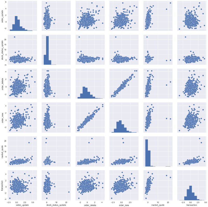
Pair plot shows that order_new and order_delete have strong positive correlation. Mark quotes is also showing strong positive correlation with almost all activities. This make perfect sense.
sns.pairplot(msg_count_scaled);
4 Running The Model
4.1 Calculation
First calculate the mean and the covariance matrix for every rolling window.
rolling_mean_scaled = msg_count_scaled.rolling(window=rolling_window).mean().shift(1)
rolling_cov_scaled = msg_count_scaled.rolling(window=rolling_window).cov().shift(msg_count_scaled.shape[1])
rolling_cov_scaled.index.names =['date', 'msg']
Then calculate the multivariate probability
# Init a container for probabilities
probabilities = pd.DataFrame(msg_count_scaled.shape[0] * [np.NaN], columns=['probability'])
probabilities.index = msg_count_scaled.index

# For each day > rolling window
for date in rolling_mean_scaled.index[rolling_window+1:]:
    event_probability = multivariate_normal.pdf(msg_count_scaled.loc[date] * weight, mean=rolling_mean_scaled.loc[date], cov=rolling_cov_scaled.loc[date])
    # print('date %s, prob %s' % (date, event_probability))
    probabilities['probability'][date] = event_probability
4.2 Outlier
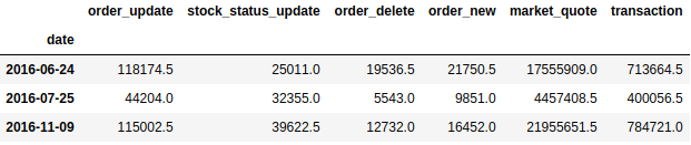
Setting threshold to 1e-50 gives me 3 outliers.
epsilon = 1e-50

# Find outliner
outliers = msg_count[probabilities['probability'] < epsilon]
outliers
4.3 Outliers Analysis
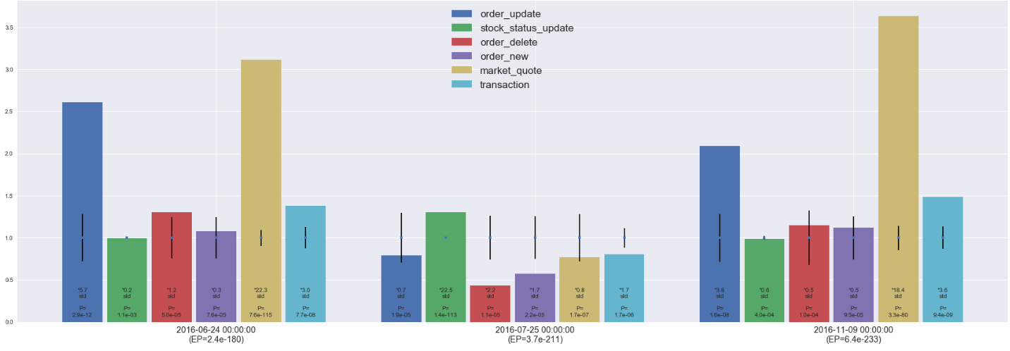
Below chart is built to show clearly what is causing the low probability:
- Each feature is scaled by their historical mean - that’s why the mean(mid-point of the error bar) is one for all of them.
- The length of error bar is one standard deviation - longer error bar mean more fluctuation
- The height of the bar is just the value / historical mean - together with the error bar shows roughly how many std it is from the mean
- Each bar also labeled with the number of std it is away from the mean, also the univariate probability when considering single feature
4 Are they really outliers?
2016-06-24
- Observation: as clearly shown in the chart, market activities increased massively - market_quote is 22.3 std from the mean!!
- Explanation: the reason is 2016-06-24 is the first trade day after the Brexit
2016-07-25
- Observation: market activities decreased significantly - while stock_status_update increased massively (22.5 std from the mean)
- Explanation: the reason is 2017-07-25 is the first trade day HKEX introduce CAS(Closing Auction Session) - which make sense to see the massive increase in stock_status_update and it is reasonable for market participants to trade conservatively on the first day a major change is introduced.
2016-11-09
- Observation: an event looks exactly the same as what happened on 2016-06-24 which is a hint of some global/regional event with major impact.
- Explanation: searched for breaking news on 2016-11-08 on Google shows that 2016-11-09 is the first trading date following the 2016 US Presidential Election!!
5 Other Thoughts
As demonstrated, the model is very robust in identifying true outliers. Setting a good threshold(epsilon) is very important for the model to reduce false alerts. Here, 1e-50 gives me outliers that were indeed outliers. For data fluctuate a lot, the model may only be able to fire when the features have consistent correlation (and the event shows inconsistency).
When there exist an NLP model that could read news. It can be used together with this model to reduce false alerts (true outliers though) like the three captured here.
6 Reference
[1] https://www.coursera.org/learn/machine-learning